NITAAC Redesign

Overview
At MetroStar, I was the lead UX designer for the redesign of a government purchasing and acquisitions site for NITAAC, an agency underneath the National Institute of Health. The site is a shopping cart application where products are posted online by NITAAC for their customers to browse and select.
Project Goals
The main goals of the project were 1) improve the overall visual design and usability, and 2) make the site mobile responsive.
Team
In addition to my role as the UX designer, the team consisted of a visual designer, project manager, QA engineers, and 6 web developers. We worked in an agile workflow to complete the redesign in a 10-month timespan.
My Role
Conduct stakeholder interviews and discovery sessions; communicate best design practice; create the UX and design process; build wireframes and communicate architecture to developers; and present research findings and design mockups.
Tools/Skills Used
- User Research
- Stakeholder Presentations
- Competitive Analysis
- Surveys/Interviews
- Wireframing/Sketching
- Visual Design
- Sketch
- Craft
- Invision
Discovery Process
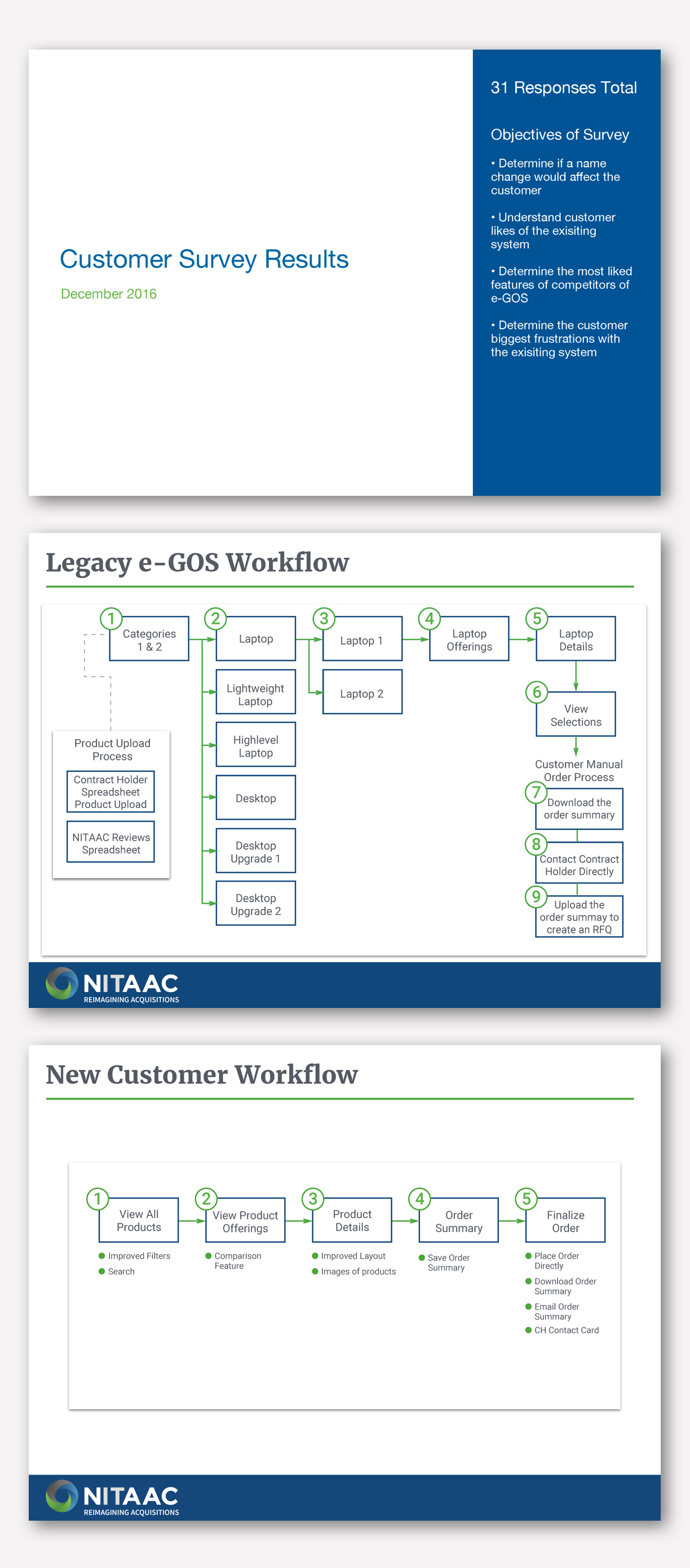
We were redesigning for three different user types: administrators, customers, and vendors. My first step was to interview SMEs and stakeholders in order to gain a better understanding of current issues and to gather requirements needed for the customer side of the site. I did a deep dive into the current customer site so I could fully understand the workflow and discover usability issues.
Due to government agency privacy issues, I had limited access to interview customers. To discover the customer’s pain points and goals, I created a 7-question Google survey that was distributed by NITAAC. I received 35 responses and was able to validate common problems, including: a slow system, customers inability to quickly locate products, and a cumbersome checkout process.
Solution
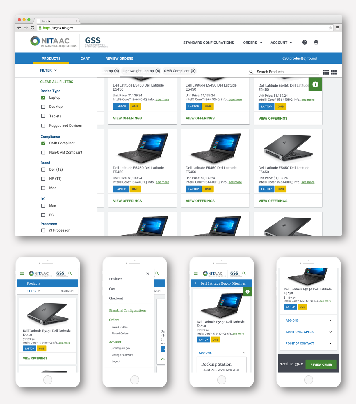
The new UX solved the customer’s problem with searching for products. The existing flow had the user clicking through 5 screens before seeing any product information. I created a new flow that allowed the user to see all products on one screen. I also designed the experience to be mobile responsive.
Wireframes
In collaboration with the visual designer and the dev team, we created a new framework for the system. We all agreed on redesigning the site using Google's Material Design library and using an Angular Material framework.
We went through many iterations of wireframes and continually worked with the developers and QA to meet all requirements in our short deadline.
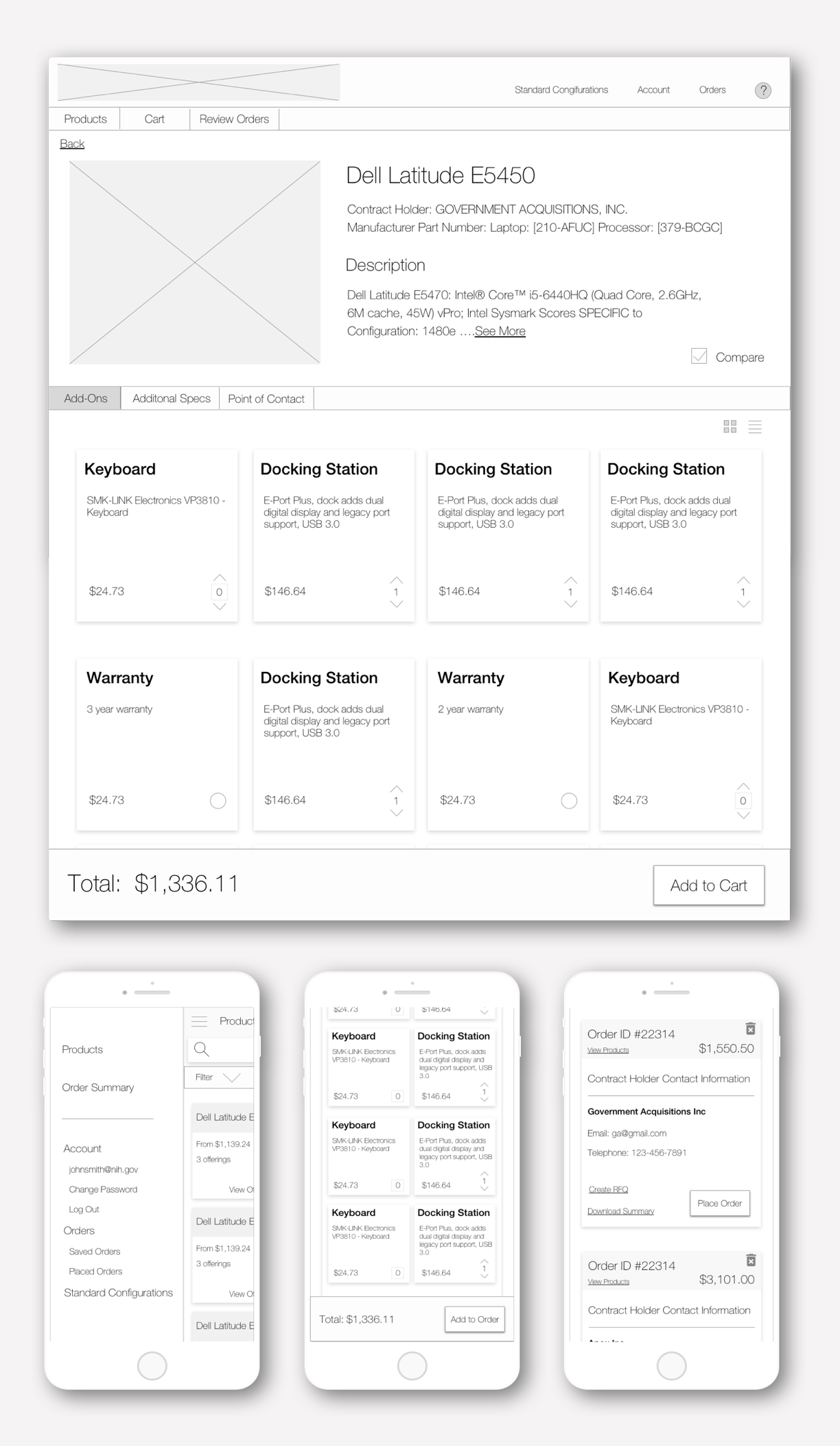
Visual Designs
Lauren Russell was the visual designer on the project. She built a material component library so we could easily design the visual UI for the project. After I finalized the wireframes, Lauren applied her material components to the design. We continued to collaborate on the visual styles for our workflow.
We used a Craft to InVision workflow for communicating changes with the dev and QA teams, and gave them a way to inspect the design for components, spacing, and styles.